C# Interface

We have two Classes ClassOne & ClassTwo and two interfaces InterfaceOne and InterfaceTwo.
Is this code valid?
interface InterfaceOne

{
void InterfaceOneMethod();
}

interface InterfaceTwo
{
void InterfaceTwoMethod();
}

class ClassOne : InterfaceOne, ClassTwo
{
public void InterfaceOneMethod()
{
//Some Code
}
}

class ClassTwo
{
}

Ans: Base class must come before interface.

class ClassOne :   ClassTwo, InterfaceOne

{
public void InterfaceOneMethod()
{
//Some Code
}
}

WinForm Interview Question(C#)

Q. There is a WinForm(Form1) with a Button(Open Form2). If the user clicks the button it should open another WinForm(Form2). If the user again click on the Button in Form1, he should get a message saying that Form2 is already open.

Ans: In Form1's Button click event add this code.

 private void Form1Bttn_Click(object sender, EventArgs e)

{
bool FormOpen = false;

//Application.OpenForms propety: Gets a collection of open forms
//owned by the application.
foreach (Form S in Application.OpenForms)
{
if (S is Form2)
{
FormOpen = true;
}
}

if (FormOpen == true)
{
MessageBox.Show("Form already open.");
}

else
{
Form MyForm = new Form2();
MyForm.Show();
}
}

Alternating Rows in an ItemsControl

We can give different styles to each row in a Control which uses ItemControl for representing a collection of Items.

The AlternationCount and ItemsControl.AlternationIndex properties of Itemcontrol class enable the user to specify the appearance for two or more alternating item containers.

The AlternationCount is the number of rows that form a sequence. If AlternationCount is set to 1, the list will alternate after every item.
Each Item(here DataGridItem) have an ItemsControl.AlternationIndex which allow the user to determine how it is numbered in the sequence. ItemsControl.AlternationIndex begins at 0, increments until it is (AlternationCount - 1), and then restarts at 0. So if the AlternationCount is 2 we can apply style to 2 Items(First Items's AlternationIndex =0, Second Item's AlternationIndex =1 and Third Item's AlternationIndex = 0, ie it will reset.)

   <Window.Resources>
<Style TargetType="{x:Type DataGridRow}">
<Style.Triggers>
<Trigger Property="ItemsControl.AlternationIndex" Value="0">
<Setter Property="Background" Value="AntiqueWhite"/>
</Trigger>
<Trigger Property="ItemsControl.AlternationIndex" Value="1">
<Setter Property="Background" Value="PaleGoldenrod"/>
</Trigger>
<Trigger Property="ItemsControl.AlternationIndex" Value="2">
<Setter Property="Background" Value="Lavender"/>
</Trigger>
<Trigger Property="ItemsControl.AlternationIndex" Value="3">
<Setter Property="Background" Value="Pink"/>
</Trigger>
</Style.Triggers>
</Style>
</Window.Resources>
<Grid>
<DataGrid x:Name="GridViewNames" AlternationCount="4">
<DataGrid.ItemTemplate>
<DataTemplate>
<StackPanel>
<TextBlock Text="{Binding Path=FistName}"/>
<TextBlock Text="{Binding Path=LastName}"/>
</StackPanel>
</DataTemplate>
</DataGrid.ItemTemplate>
</DataGrid>
</Grid>


Refrence:http://msdn.microsoft.com/en-us/library/system.windows.controls.itemscontrol.alternationcount.aspx

WPF Brushes

In WPF everything is visible because it is painted with Brush.Brushes enable the user to paint user interface (UI) controls with anything from simple, solid colors to complex sets of patterns and images.A brush is used to describe background of a button, the foreground of text(font color), and the filling color of the shape.

A Brush "paints" an area with its output. Different brushes have different types of output. Brushes can paint an area with a solid color/with a gradient/pattern/ image/ drawing.
There are diffenrent types of Brushes.

  1. SolidColorBrush
  2. LinearGradientBrush
  3. RadialGradientBrush
  4. ImageBrush

SolidColorBrush: paints an area with a solid Color. We can fill the area either with the predefined color provided by the Colors class or using RGB color codes.(Color Picker)


<Ellipse Stroke="Black" StrokeThickness="2" Margin="35,130,435,324">
<Ellipse.Fill>
<SolidColorBrush Color="DarkOrange"></SolidColorBrush>
</Ellipse.Fill>
</Ellipse>
<Label Content="SolidColorBrush" Height="30"
HorizontalAlignment="Left" Margin="35,80,0,0"
Name="SolidColorBrushLabel" VerticalAlignment="Top"
Width="100" Background="DarkOrange"/>

LinearGradientBrush: paints an area with a linear gradient. A linear gradient blends two or more colors across a line, the gradient axis. Use GradientStop objects to specify the colors in the gradient and their positions.
The default linear gradient is diagonal. In the default, the StartPoint of a linear gradient is (0,0), the upper-left corner of the area being painted, and its EndPoint is (1,1), the lower-right corner of the area being painted. The colors in the resulting gradient are interpolated along the diagonal path. If we want to the linear gradient Horizontal, set the StartPoint="0,0" and EndPoint="0,1" and for Vertical gradient StartPoint="0,0" and EndPoint="1,0"(Refresh X-Y Cartesian Coordinate System you learned in high school math class.:)) -

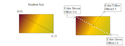

A line was added to highlight the interpolation path of the gradient from the start point to the end point.


<Grid>
<Rectangle Height="100" HorizontalAlignment="Left"
Margin="55,125,0,0" Name="LinearGradientBrushRectangle"
Stroke="Black" VerticalAlignment="Top" Width="180" >
<Rectangle.Fill>
<LinearGradientBrush>
<GradientStop Color="#660033" Offset="0.0" />
<GradientStop Color="#FFCC00" Offset="0.5" />
<GradientStop Color="#BABA21" Offset="1" />
</LinearGradientBrush>
</Rectangle.Fill>
</Rectangle>
<Label Content="LinearGradientBrush " Height="30"
HorizontalAlignment="Left" Margin="70,70,0,0"
Name="LinearGradientBrushLabel" VerticalAlignment="Top" >
<Label.Background>
<LinearGradientBrush>
<GradientStop Color="#660033" Offset="0.0" />
<GradientStop Color="#FFCC00" Offset="0.5" />
<GradientStop Color="#BABA21" Offset="1" />
</LinearGradientBrush>
</Label.Background>
</Label>
</Grid>

RadialGradientBrush: paints an area with a radial gradient. A radial gradient blends two or more colors across a circle.


    <Grid>
<Polygon Points="300,200 400,125 400,275 300,200" Margin="-183,-12,161,12">
<Polygon.Fill>
<RadialGradientBrush GradientOrigin="0.5,0.5">
<GradientStop Color=" #800080" Offset="0"/>
<GradientStop Color="Sienna" Offset="0.5"/>
<GradientStop Color="#4AA02C" Offset="1">
</GradientStop>
</RadialGradientBrush>
</Polygon.Fill>
</Polygon>
<Label Content="RadialGradientBrush " Height="30" HorizontalAlignment="Left" Margin="138,76,0,0" Name="RadialGradientBrushLabel" VerticalAlignment="Top" >
<Label.Background>
<RadialGradientBrush GradientOrigin="0.5,.7">
<GradientStop Color=" #800080" Offset="0"/>
<GradientStop Color="Sienna" Offset="0.5"/>
<GradientStop Color="#4AA02C" Offset="1"/>
</RadialGradientBrush>
</Label.Background>
</Label>
</Grid>


ImageBrush: paints an area with a ImageSource.


<Grid>
<Label Content="ImageBrush" Height="30"
HorizontalAlignment="Left" Margin="129,47,0,0"
Name="ImageBrushLabel" VerticalAlignment="Top"
FontWeight="Bold" >
<Label.Background>
<ImageBrush Viewbox="0.6,0.3,0.6,0.7" ImageSource="Image\ImageBrush.png"/>
</Label.Background>
</Label>
<Ellipse Height="80" HorizontalAlignment="Left"
Margin="95,101,0,0" Name="ImageBrushEllipse"
Stroke="Black" VerticalAlignment="Top" Width="145" >
<Ellipse.Fill>
<ImageBrush ImageSource="Image\ImageBrush.png"/>
</Ellipse.Fill>
</Ellipse>
</Grid>


References: http://msdn.microsoft.com/en-us/library/system.windows.media.brush.aspx

WPF Styles

Before starting WPF styles lets check some of the properties and classes used in styling.
In WPF everything is visible because it is painted with Brush.A brush is used to describe background of a button, the foreground of text(font color), and the filling color of the shape.

Brushes Tutorial


BasedOn:Gets or sets a defined style that is the basis of the current style.
Dispatcher:Gets the Dispatcher this DispatcherObject is associated with. (Inherited from DispatcherObject.)
IsSealed:Gets a value that indicates whether the style is read-only and cannot be changed.
Resources:Gets or sets the collection of resources that can be used within the scope of this style.
Setters:Gets a collection of Setter and EventSetter objects.
TargetType: Gets or sets the type for which this style is intended.
Triggers: Gets a collection of TriggerBase objects that apply property values based on specified conditions.


References: http://msdn.microsoft.com/en-us/library/system.windows.style.aspx

WPF ListBox Template Binding using MVVM

MVVM pattern can be described as follows:

Model: The data access layer.
View: The GUI(Windows, Graphics, controls,..) and the codebehind file) or in other-words a view is a .xaml/.xaml.cs pair.
ViewModel: Can be compared to a Controller, who binds data between the View and the Model. It passes the commands form View to Model.

Our example is a simple data binding of ListBox.

  • Create a new WPF project.

  • Create three folders to the project- Model,View and ViewModel.

  • Delete the MainWindow.xaml from the project, and create a new WPF window in View folder. I named it ListBoxView.( It is a clean practice to postfix views with 'View', view models with 'ViewModel' and Models with 'Model')

  • Modify the App.xaml and App.xaml.cs as follows.

  •  <!--App.xaml--> 

    <Application x:Class="ListBoxSampleNamespace.App"
    xmlns="http://schemas.microsoft.com/winfx/2006/xaml/presentation"
    xmlns:x="http://schemas.microsoft.com/winfx/2006/xaml"
    Startup="Application_Startup">
    <Application.Resources>

    </Application.Resources>
    </Application>


    //App.xaml.cs 
    public partial class App : Application
    {

    private void Application_Startup(object sender, StartupEventArgs e)
    {
    ListBoxView myView = new ListBoxView();
    Application.Current.MainWindow = myView;
    myView.Show();
    }
    }


  • We are going to display the details of the People in a ListBox. So lets create a 'PeopleDataModel' class in the Model folder.

  • namespace ListBoxSampleNamespace.Model
    {
    public class PeopleDataModel
    {
    public string FirstName { get; set; }
    public string LastName { get; set; }
    public int Age { get; set; }
    public PeopleDataModel(string fname, string lname, int age)
    {
    this.FirstName = fname;
    this.LastName = lname;
    this.Age = age;
    }
    }
    }

  • Create a class named 'ViewModel.cs' in the ViewModel folder.

  • // Interaction logic for ListboxTemplateViewModel
    namespace ListBoxSampleNamespace.ViewModel
    {
    public class ListboxTemplateViewModel
    {
    public ObservableCollection<PeopleDataModel> PeopleDataCollection { get; set; }

    public ListboxTemplateViewModel()
    {
    public class ListboxTemplateViewModel : INotifyPropertyChanged
    {
    public ObservableCollection<PeopleDataModel> PeopleDataCollection { get; set; }

    public ListboxTemplateViewModel()
    {
    PeopleDataCollection = new ObservableCollection<PeopleDataModel>();

    PeopleDataCollection.Add(new PeopleDataModel("FirstName1", "LastName1", 27));
    PeopleDataCollection.Add(new PeopleDataModel("FirstName2", "LastName2", 32));
    PeopleDataCollection.Add(new PeopleDataModel("FirstName3", "LastName3", 57));
    PeopleDataCollection.Add(new PeopleDataModel("FirstName4", "LastName4", 51));
    }
    }
    }

    The ViewModel class has list of PeopleDataModel. ObservableCollection is built-in generic collection used for databinding, it can raises events automatically when an item is added or removed.(Right now we are not raising events in this example).

  • The View’s DataContext is wired up to the associated ViewModel using this code in the application startup.

  • /// Interaction logic for ListBoxView.xaml

    public partial class ListBoxView : Window
    {
    public ListBoxView()
    {
    InitializeComponent();
    DataContext = new ListBoxSampleNamespace.ViewModel.ListboxTemplateViewModel();
    }
    }
    }

  • Now we have define the View and bind data to it.

  • <ListBox x:Name="PeopleListBox" Width="300" MaxHeight="150" ItemsSource="{Binding PeopleDataCollection}" IsSynchronizedWithCurrentItem="True">
    <ListBox.ItemTemplate>
    <DataTemplate>
    <Border BorderBrush="Orange" BorderThickness="2" Background="OrangeRed">
    <StackPanel Orientation="Vertical">
    <TextBlock FontSize="12" Text="{Binding Path=FirstName}" />
    <TextBlock FontSize="12" Text="{Binding Path=LastName}" />
    <StackPanel>
    <TextBlock FontSize="10" Text="{Binding Path=Age}" />
    </StackPanel>
    </StackPanel>
    </Border>
    </DataTemplate>
    </ListBox.ItemTemplate>
    </ListBox>


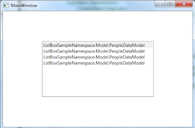
    The ItemsSource="{Binding PeopleDataCollection}"of the ListBox defines the Binding source. Without a DataTemplate, our ListBox currently looks like this:


    This happens because without specific instructions, the ListBox just calls ToString when trying to display the objects in the PeopleDataCollection.
    Therefore, we can overrides the ToString method, then the ListBox displays the string representation of each object in the underlying Collection(PeopleDataCollection).In our example add this code to the PeopleDataModel class.

     public override string ToString()
    {
    string result = null;
    result = FirstName +LastName+ Age.ToString();
    return result;
    }


    Still this method is inflexible. Also, if we want to bind to XML data, we cannot override ToString().
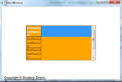
    Therefore the solution is to define a DataTemplate. Set the ItemTemplate property of the ListBox to a DataTemplate. What we specify in the DataTemplate becomes the visual structure of our data object.
    We are giving instructions that each item appears as three TextBlock elements within a StackPanel. Each TextBlock element is bound to a property of the PeopleDataModel class.

    When you run this program:


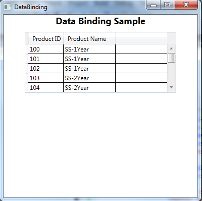
A simple WPF DataGrid application to show the ProductName and ProductID from Database using Entity Framework.

  1. Create a new WPF Project.

  2. Rename the Main window to DataGridSample.xaml( Make sure you rename the StartupUri in App.xaml too).

  3. Drag and drop DataGrid to this window and Name it ProductDataGrid.

  4. <DataGrid Name="ProductDataGrid"  AutoGenerateColumns="False" Height="120" Width="350" Margin="10" />

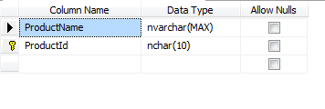
  5. Create a table named "Products" in your Database( I use SQL Server 2008)


  6. Create Model Classes with the Entity Framework.
  7. Create Model.

  8. Create an instance of this Model in your Codebehind class.(Here the ProductEntity)

  9. ProductEntities _Product = new ProductEntities();

  10. Use this LINQ query to get the ProductName and ProductID

  11. var prod = from p in _customer.Products
    select new { ProdId = p.ProductId, ProdName = p.ProductName };

  12. We have to bind the DataGrid columns are bind to ProdID and ProdName, so we have to add this code to the DataGrid Control in the DataGridSample.xaml


  13. <DataGrid Name="ProductDataGrid" AutoGenerateColumns="False" Height="120"  Width="350" Margin="10" ItemsSource="{Binding}" >
    <DataGrid.Columns>
    <DataGridTextColumn Header=" Product Name" Binding="{Binding ProdId}"/>
    <DataGridTextColumn Header=" Product Name" Binding="{Binding ProdName}"/>
    </DataGrid.Columns>
    </DataGrid>

  14. Use DataContext to bind DataGrid to "prod".
ProductDataGrid.DataContext = prod;

DataBindingSample.cs
------------------------
public partial class DataBindingSample: Window
{
//Model class Instance.
ProductEntities _Product;

public DataBindingSample()
{
InitializeComponent();
_Product = new ProductEntities();
var prod = from p in _Product.Products
select new { ProdId = p.ProductId,
ProdName = p.ProductName };
ProductDataGrid.DataContext = prod;
}
}


DataBindingSample.xaml
------------------------
<StackPanel>
<DataGrid Name="ProductDataGrid" AutoGenerateColumns="False" Height="120" Width="300" Margin="10" ItemsSource="{Binding}" >
<DataGrid.Columns>
<DataGridTextColumn Header=" Product ID" Binding="{Binding ProdId}"/>
<DataGridTextColumn Header=" Product Name" Binding="{Binding ProdName}"/>
</DataGrid.Columns>
</DataGrid>
</StackPanel>


ASP.Net Interview Questions and Answers.


  1. Can you put the ViewState in the Session if yes how and why?

  2. Yes. we can store ViewState in Session.But this Session require good chunk of memory on the server.


    // Store ViewState to Session
    ViewState["myViewState"] = "ASP.Net";
    Session["mySession"] = ViewState["myViewState"];

    // Retrieve ViewState from Session
    ViewState["RetrievedValue"] = Session["mySession"];
    String ViewStateValue = ViewState["RetrievedValue"].ToString();